-
Type:
Improvement
-
Status: Open
-
Priority:
 Major
Major
-
Resolution: Unresolved
-
Affects Version/s: None
-
Fix Version/s: None
-
Component/s: A11y
-
Tags:
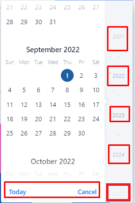
Where to find:
- Browse to a workspace
- Create a file
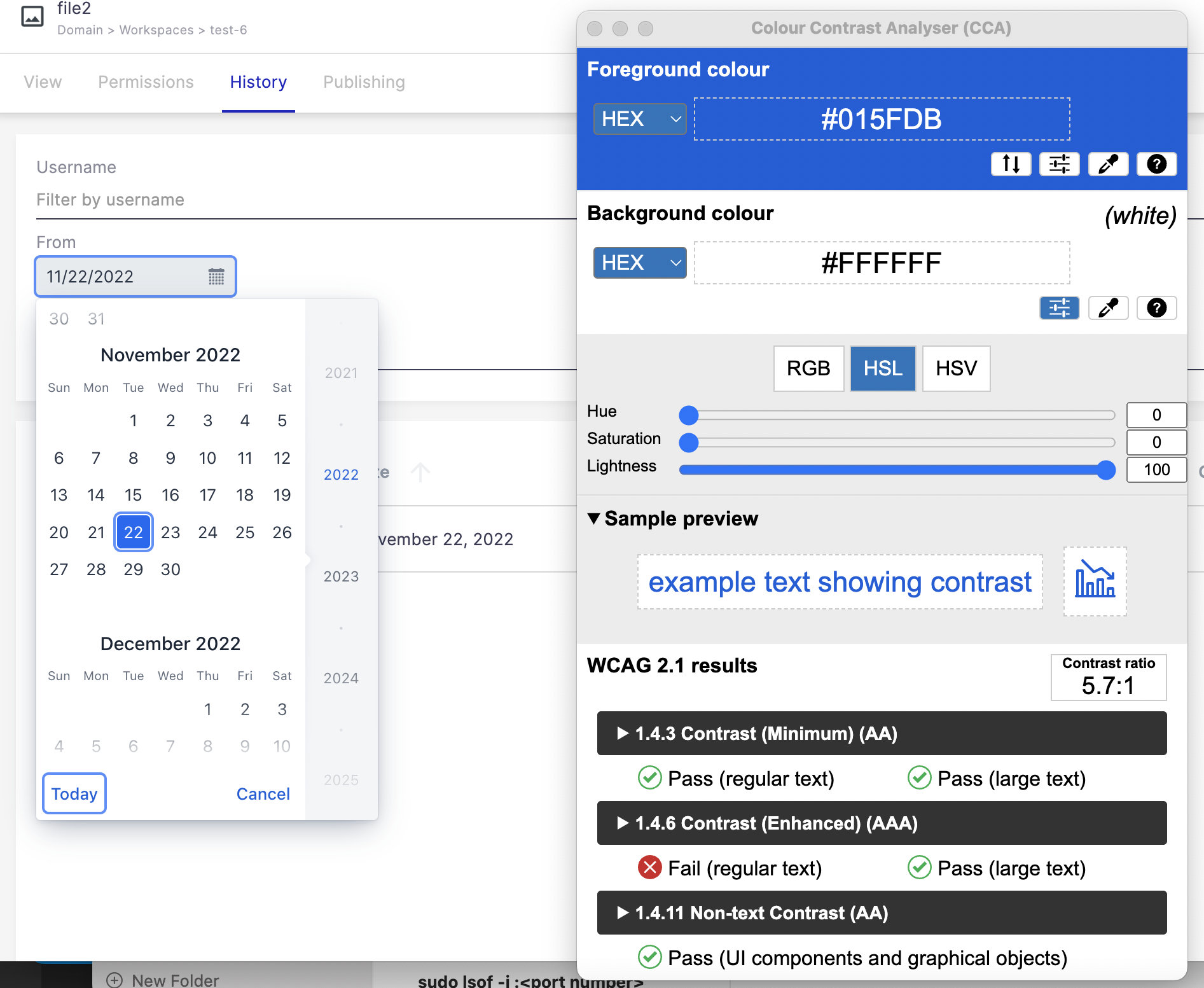
- in the creation dialog, use the date picker, e.g. for the "expires" field
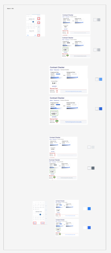
Elements must have sufficient color contrast
Element name: weekday
Recommendation to fix
Fix any of the following:
Element has insufficient color contrast of 2.94 (foreground color: #8e98a5, background color: #ffffff, font size: 7.9pt (10.5625px), font weight: normal). Expected contrast ratio of 4.5:1
Element Name:
- The unselected year button(For example "2023") which is just below the selected year.
Foreground: #8C949E
Background: #F3F5F7
Contrast Ratio: 2.8:1
- The unselected year button which is the 1st and 4th years visible in the calendar. For example "2021", "2024".
Foreground: #BBC1C7
Background: #F3F5F7
Contrast Ratio: 1.7:1
- The selected year button. For example "2022".
Foreground: #85B6F5
Background: #F3F5F7
Contrast Ratio: 1.9:1
- The "Today" and "Cancel" buttons:
Foreground: #1676F3
Background: #FFFFFF
Contrast Ratio: 4.3:1
- The last visible year button to the bottom of the calendar (example "2025"):
Foreground: #E4E7EA
Background: #F4F5F8
Contrast Ratio: 1.1:1
Location of the element: In the calendar.
Recommendation to fix
RULE :
Small text (under 18 point regular font or 14 point bold font) MUST have a contrast ratio of at least 4.5 to 1 with the background.
HOW TO FIX:
Fix this issue by adjusting the text and/or background to increase the contrast to at least 4.5 to 1.
REFERENCE:
Deque University: https://dequeuniversity.com/class/visual-design2/contrast/text-against-background
BACKGROUND:
People who have low vision or are colorblind may have difficulty reading text if the contrast between the text its background is insufficient. When the contrast ratio between text and its background is adequate, people who have low vision or are colorblind are more likely to be able to read the text.