-
Type:
Improvement
-
Status: Resolved
-
Priority:
 Major
Major
-
Resolution: Duplicate
-
Affects Version/s: None
-
Fix Version/s: None
-
Component/s: A11y
-
Tags:
-
Sprint:UI - 2022-13
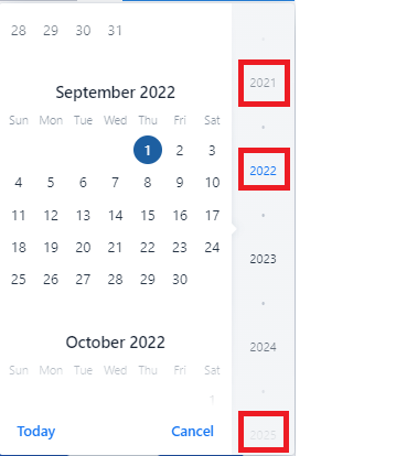
Where to find:
- Browse to a workspace
- Create a file
- in the creation dialog, use the date picker, e.g. for the "expires" field
The contrast ratio between link or button text and its background is not at least 4.5:1 on hover and/or on focus.
Element Name:
1. The following buttons:
- Today
- Cancel
on hover:
Foreground: #1676F3
Background: #F4F9FE
Contrast Ratio: 4:1
2. The selected year button (example "2022"):
on hover:
Foreground: #2A81F3
Background: #F4F5F8
Contrast Ratio: 3.5:1
3. The year date above the selected date (example "2021"):
on hover:
Foreground: #878F99
Background: #F3F5F7
Contrast Ratio: just below 3:1 (2.993:1)
4. The last visible year button to the bottom of the calendar (example "2025"):
on hover:
Foreground: #D4D8DC
Background: #F4F5F8
Contrast Ratio: 1.3:1
Location of the element: In the Calendar
Recommendation to fix
RULE :
Small text (under 18 point regular font or 14 point bold font) MUST have a contrast ratio of at least 4.5 to 1 with the background.
HOW TO FIX:
Fix this issue by adjusting the color of the hovered or focused link or button text and/or background to increase the contrast to at least 4.5 to 1.
REFERENCE:
Deque University: https://dequeuniversity.com/class/visual-design2/contrast/text-against-background
BACKGROUND:
People who have low vision or are colorblind may have difficulty reading text if the contrast between the text its background is insufficient. When the contrast ratio between text and its background is adequate, people who have low vision or are colorblind are more likely to be able to read the text.