-
Type:
Improvement
-
Status: Resolved
-
Priority:
Minor
-
Resolution: Fixed
-
Affects Version/s: 21.2
-
Fix Version/s: 32
-
Component/s: Ergonomy / UX / UI
-
Epic Link:
-
Sprint:TGV 7.2-7
-
Story Points:3
Today issues:
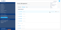
- Project and Settings & Versioning sections do not show indications that they are actually menus. This is confusing for users who do not understand they can open the Settings & Versioning menu for instance.
- Browsing in one section close the other one and it's painful to reopen it each time you need it.
- The sections are not really readable because of all the graphical elements
Things to do in the ticket:
- Display the menus as simple divs that you can scroll
- Remove categories icons
- Update + and - icons on tree (old and pixelated)
Things to do in addition:
- Rename sections from "Project / Settings & Versioning" to "Design & Code / Source Control / Definition & Dependencies" -> see
NXS-1897 - Remove actionbar (new, import, download, commit) -> see NXS-1865
- Review info box -> see
NXS-1905
The ordering of categories (resources, branding, content model, etc ..) in each section is not the purpose of this ticket and should be done separately when needed.
