-
Type:
Improvement
-
Status: Open
-
Priority:
Minor
-
Resolution: Unresolved
-
Affects Version/s: 2.15
-
Fix Version/s: QualifiedToSchedule
-
Component/s: Ergonomy / UX / UI
-
Tags:
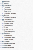
The current tree display in the main column, that allows user to navigate in features, have to be improved:
- the main sections and subsections are hardly readable at the first sight
- too many icons displayed are confusing
- the vocabulary learning should be doable faster -> too many notions to learn currently.
- is required by
-
NXS-1869 Display main info as tooltip on rollover in the tree
-
- Open
-
1.
|
Labels > Tree items |
|
Open | Unassigned |
