-
Type:
 User story
-
Status: Open
-
Priority:
Minor
-
Resolution: Unresolved
-
Affects Version/s: None
-
Fix Version/s: QualifiedToSchedule
-
Component/s: Ergonomy & UX, Web UI
-
Epic Link:
-
Tags:
-
Team:UI
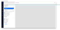
Particularly when you have large sets of metadata, it can be difficult to see/manage the aggregates chosen to facet on. Likewise, when you want to remove facets, you have to scroll throughout all your aggregates to remove values from your query.
AC:
- I see a listing of the values I've selected as aggregates for my query
- I see a way to remove the selection from my query
- When I remove an item from my query, the search results are updated
- when I have a long list of aggregates/filters, i have a vertical scroll bar and the "clear filter" action is fixed at the bottom
- When I have 0 filters we show an "empty state"
- The feature works in RTL mode
- is related to
-
 NXP-28487
as a user, I can easily "expand/collapse" search facets when there are "numerous" fields/facets to choose from
-
- Resolved
-
