-
Type:
 User story
-
Status: Resolved
-
Priority:
Major
-
Resolution: Fixed
-
Affects Version/s: None
-
Component/s: Ergonomy & UX, Web UI
-
Epic Link:
-
Tags:
-
Team:UI
-
Sprint:nxGang Sprint 11.1.29, nxGang Sprint 11.1.30, nxGang Sprint 11.1.31, UI - 2020-05 1, UI - 2020-05 2, UI - 2020-06 1, UI - 2020-06 2
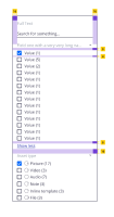
When there are more than a handful of aggregates/field values on a search, the current UX on faceting is not very good: requires a lot of scrolling and can be hard to follow what you need to search on.
https://nuxeo.invisionapp.com/freehand/document/KudoGCfL9 (third iteration search area towards the bottom)
Link to inspect mockup: https://nuxeo.invisionapp.com/share/SFVHMCHEX3K#/400087973_Search_-show_Less-
AC:
- I see fields collapsed by default
- I can expand fields
- when I expand, I see the first 8 aggregates
- if there are more than 8 aggregates, I see a link to click to "Show More"
- When I "Show More", I see all the remaining aggregates
- I then can see a "Show Less" action that will collapse them back to 8 aggregates.
- The size of margins and icon sizes are on images attached to the ticket
- depends on
-
ELEMENTS-1159 Create nuxeo-collapsible element
-
- Resolved
-
-
ELEMENTS-1170 Add collapsible feature to nuxeo-checkbox-aggregation
-
- Resolved
-
- is duplicated by
-
NXP-25820 Sections on collapsible sidebar
-
- Resolved
-
- is related to
-
DESIGN-448 Iterate solutions for complex metadata
-
- Resolved
-
-
 NXP-28491
As a user, I can quickly manage/modify my search facets
-
- Open
-
- Is referenced in


