Current problem
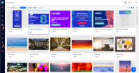
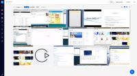
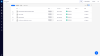
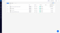
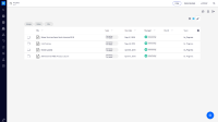
Fot listing (folderish or search) we have three different rows with actions and options.
One row was already taken care of on ELEMENTS-739
We still have too much top space spent.
Proposed solution
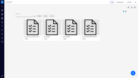
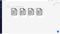
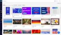
Use just one row as seen in the different mockups.
Order of elements:
- Sort (if enabled)
- Quick filters (should take the all remaining central area and have horizontal scroll)
- View modes
- results slot (with no showing actions, just the drop menu)
sort Improvement suggestion
The label of the element should be placed before the name/field itself, to be everything in 1 line only.
The space/lenght of the line should be relative to the content, growing as need, assuring only a minimal padding next to the word.
The dropdown should also change its width accordingly to its content, aligned to the left of the input area.
- depends on
-
DESIGN-4 Improve grid view area on Folderish view.
-
- Resolved
-
-
ELEMENTS-793 Move sorting and filtering logic of listing elements to Web UI
-
- Resolved
-
- is duplicated by
-
NXP-25734 Display the results count in the Search Results page
-
- Resolved
-
-
ELEMENTS-739 Improvement of the Nuxeo-sort element
-
- Resolved
-
- is related to
-
NXP-23387 Refactor results fetch API
-
- Open
-
-
NXS-4970 Update nuxeo-results editor templates
-
- Resolved
-
-
NXS-5551 Missing display-quick-filters attribute in nuxeo-data-table in nuxeo-results element generated by Studio
-
- Resolved
-
