Uploaded image for project: 'DESIGN'
  1. DESIGN
  2. DESIGN-395

Editing comments should be contextual

    XMLWordPrintable

    Details

    • Type: Improvement
    • Status: Resolved
    • Priority: Minor
    • Resolution: Fixed
    • Component/s: Web UI

      Description

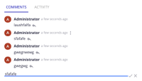
      Currently, when we edit a comment, the editing input area appears at the bottom of the thread and that can lead the user to a lost in space feeling.

      Contextually editing, would be the expected behavior.
      Screenshot of current behavior + Screenshot of expected behavior.
      (also included a small gif)

      Also, If possible, the actions available on the dropdown should reveal the nuxeo-primary-color as bgcolor on hover (consistently with the nuxeo-selectivity and other drops, to give a clear feedback to the user, on what he is about to click).
        Attachments

          Issue Links

            Activity

              People

              • Assignee:
                imachado Isabel Machado
                Reporter:
                imachado Isabel Machado
                Participants:
              • Votes:
                0 Vote for this issue
                Watchers:
                1 Start watching this issue

                Dates

                • Created:
                  Updated:
                  Resolved: