-
Type:
Improvement
-
Status: Open
-
Priority:
Minor
-
Resolution: Unresolved
-
Affects Version/s: None
-
Fix Version/s: None
-
Component/s: ML Data Enrichment
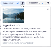
Some users referred that would like to know a more concrete information, regarding the confidence of the model suggestions.
The 3 bars are still a good solution, clean and unambiguous, as a second level of information, I suggest to include the % on mouseover as a tooltip on desktop and include on the extended drop area, right after the suggestion title.
Mockups attached
- is related to
-
DESIGN-463 Improve UI feedbaack on suggestions confidence
-
- Resolved
-


