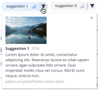
Currently we show the convidence on a visual element with 3 bars.
At some point, we should consider giving a more precise value of confidence, like a percentage from 0-100.
Consider it on mouseover, as a tooltip. Also, on the dropdown, to see more info.
Thread Highlights:
Said Randy Rowles
"would be really good to have 2 user types - Advanced for seeing the confidence and regular that just see tags over a certain threshold."
&
Said Joel Warwick
"Agreed - admins will want to know but for users probably not good. But nice for demo I think. I like the % much better than the ‘mobile signal strength’ bar graph in other AI demos (for admins at least)."
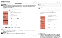
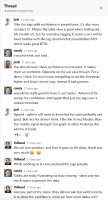
Attaching screenshots of the conversation about this theme, on #solution-engineering
- is related to
-
AICORE-281 UX Improvement on AI suggestions UI
-
- Open
-
-
DESIGN-319 UI for Document AI suggestions
-
- Resolved
-


