-
Type:
Improvement
-
Status: Resolved
-
Priority:
 Major
Major
-
Resolution: Cannot Reproduce
-
Affects Version/s: None
-
Fix Version/s: None
-
Component/s: A11y
-
Tags:
-
Sprint:UI - 2023-3
The state of an ACTIVE user interface component does not have at least a 3 to 1 luminosity contrast ratio with either the inner or outer adjacent background.
Element Name:
Set 1 controls
Edit Document
Delete Document
Add a collection document
Add a Favourite document
Share
More
Set 2 controls
Full screen
Read mode
Download
Details icon
Location: In the top right corner of the main region of the page.
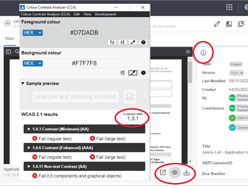
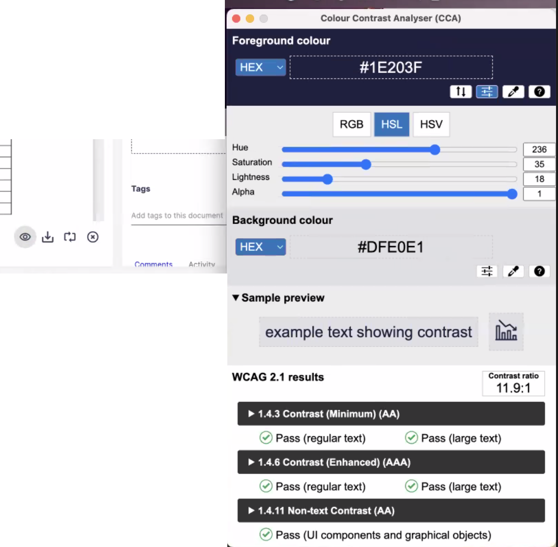
Contrast ratio:
Set 1
Focus indicator color: #DEDFE1
Surrounding color: #FFFFFD
ratio:1.3:1
Set 2
Contrast ratio:
Focus indicator color: #D7DADB
Surrounding color: #F7F7F8
ratio:1.3:1
Recommendation to fix
RULE :
The visual state of an active user interface component MUST have sufficient contrast of 3 to 1 with the adjacent background. Exceptions exist.
HOW TO FIX:
Fix this issue by adjusting the visual focus indicator or state indicator (e.g. selected, checked, pressed, etc.) of the user interface component and/or background to increase the contrast with either the inner or outer adjacent background to at least 3 to 1.
REFERENCE:
WCAG Understanding document: https://www.w3.org/WAI/WCAG21/Understanding/non-text-contrast
BACKGROUND:
People who have low vision or are colorblind may have difficulty perceiving that an element is interactive or what its state is - e.g. whether it has keyboard focus, is selected/checked/pressed, etc. - if the contrast between the element boundaries and/or state indicators and its background or adjacent colors is insufficient. When an interactive element's visual boundaries and state indicators have adequate contrast, people who have low vision or are colorblind are more likely to be able to perceive which elements on the screen are interactive and what their current state is.