-
Type:
Improvement
-
Status: Resolved
-
Priority:
Major
-
Resolution: Not A Bug
-
Affects Version/s: 3.0.15
-
Fix Version/s: None
-
Component/s: A11y
-
Tags:
In web ui:
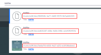
use quick search (top right icon)
search for a keyword and get some results (e.g., workspace)
=> the path of the document is shown below its title
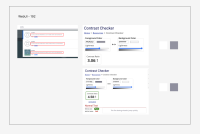
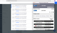
The contrast ratio between text and its background is not at least 4.5:1.
Foreground: #949492
Background: #FFFFFF
Contrast Ratio: 3:1
Recommendation to fix
RULE :
Small text (under 18 point regular font or 14 point bold font) MUST have a contrast ratio of at least 4.5 to 1 with the background.
HOW TO FIX:
Fix this issue by adjusting the text and/or background to increase the contrast to at least 4.5 to 1.
REFERENCE:
Deque University: https://dequeuniversity.com/class/visual-design2/contrast/text-against-background
BACKGROUND:
People who have low vision or are colorblind may have difficulty reading text if the contrast between the text its background is insufficient. When the contrast ratio between text and its background is adequate, people who have low vision or are colorblind are more likely to be able to read the text.


