 Major
Major in web ui:
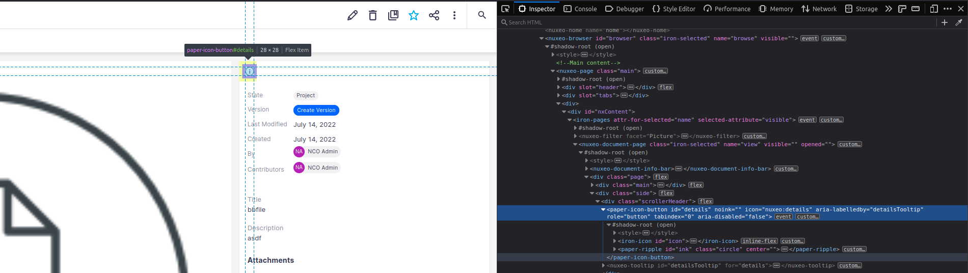
browse a document
=> the  icon that is used to collapse / expand the metadata layout does not convey its name or state to the screen reader, it is missing a label and a state property
expected: name and state should be announced by the screen reader
_____________________________
The button is missing an accessible name/label. As a result its functionality or purpose is not conveyed to screen reader users.
Element Name:i (information icon) control
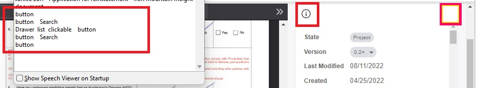
NVDA is not narrating Name of the information icon button present in the page
Recommendation to fix
RULE :
The name, role, value, states, and properties of user interface components MUST be programmatically determinable by assistive technologies.
HOW TO FIX:
Fix this issue by using any of the following techniques:
1. Use the innertext of the <button> or role="button" element
<button>Apply now!</button>
<button class="apply-btn"><span class="sr-text">Apply now!</span></button>
2. Use a non-empty aria-label attribute on the <button> or role="button" element.
<button class="apply-btn" aria-label="Apply now!"></button>
<span role="button" class="apply-btn" aria-label="Apply Now!"></span>
REFERENCE:
Deque University: https://dequeuniversity.com/class/custom-widgets2/concepts/name
W3C ARIA Recommendation: https://www.w3.org/TR/wai-aria-1.1/#aria-label
BACKGROUND:
Buttons must have discernible text that describes the button's function or action for screen reader and other assistive technology users.
______________________________
The expand/collapse state of a toggle-type element is missing or is used incorrectly.
Element Name:i (information icon) control
NVDA is not narrating state as Expanded Collapsed for the information icon button present in the page
Recommendation to fix
RULE :
The name, role, value, states, and properties of user interface components MUST be programmatically determinable by assistive technologies.
HOW TO FIX:
Fix this issue by using the aria-expanded attribute on the actionable toggle element (e.g. the <button> element) with a value of "true" (when the section is expanded) or "false" (when the section is collapsed).
<h3><button aria-expanded="true">When will I receive my refund?</button></h3>
<div class="faq-expanded">You should receive your refund within 5 business days....</div>
REFERENCE:
W3C ARIA Recommendation: https://www.w3.org/TR/wai-aria-1.1/#aria-expanded
BACKGROUND:
The aria-expanded attribute is placed on the toggle element (not the content that is hidden/shown).
- links to
