Related to WCAG 2.1 level AA criteria 1.4.3 minimum contrast
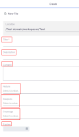
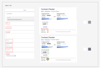
Currently, input labels do not have enough contrast.
Target is to match our design guidelines: provide more contrast (at least 3:1 ratio) and reduce the text size to differentiate between the label and the input.
To reproduce, navigate to a workspace and open the file creation dialog.

