Related to WCAG 2.1 level AA criteria 2.4.6
https://www.w3.org/TR/WCAG21/#headings-and-labels
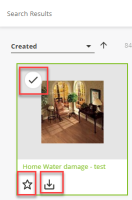
The label does not convey the purpose of the control.
Elements:
- "Select" icon button
- "Favorites" icon button
- "Download" icon button
Location:
- "Search results" section
The buttons appear on hover on search results individual links:
- "Home water damage test"
- "My favorites"
- "6 Browse workspace and filter..."
and so on
The current labels "Select", "Add to Favorites" and "Download" button do not convey the items that will be selected, added to favorite or downloaded to the screen reader users.
Expected: action label should indicate which item it is related to (e.g. add the document title)
Recommendation to fix
RULE :
Labels MUST be meaningful.
HOW TO FIX:
Fix this issue by providing a descriptive label for the control.
REFERENCE:
Deque University: https://dequeuniversity.com/class/forms2/labels/meaningful
BACKGROUND:
When form fields or interactive controls have vague or misleading labels, people may not understand the type of data expected or what a control will do if activated. This is especially true for people with cognitive disabilities and people who are blind and use a screen reader. Both the visible and the programmatic label must sufficiently describe the purpose of the form field or control. Descriptive labels give people confidence when filling out a form or using interactive content and help prevent mistakes.
- clones
-
ELEMENTS-1427 Improve label for sort order button
-
- Resolved
-
- is cloned by
-
ELEMENTS-1577 Make labels for grid actions meaningful
-
- Resolved
-
-
WEBUI-509 Make each label unique for button to remove file during import
-
- Resolved
-
- links to

