Uploaded image for project: 'Nuxeo Web UI'
  1. Nuxeo Web UI
  2. WEBUI-1228

Improve appearance of Edit/Delete dialog in Comments

    XMLWordPrintable

    Details

    • Type: Improvement
    • Status: Open
    • Priority: Minor
    • Resolution: Unresolved
    • Affects Version/s: 3.0.25
    • Fix Version/s: 3.0.x, 3.1.x
    • Component/s: Web UI

      Description

      Pre-requisite

      1.Login with user credentials with long user name ex. 'test4545sunset44paradiseview12345firstsecondthirdfour'

      Steps to Reproduce

      1.Add comments on asset

      2.Click on more options (3 dots at end of user name)

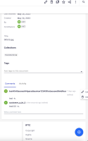
      Actual result- The Edit/Delete dialog shows as edge of screen and you have to use the scroll bar within the dialog to see the labels for the buttons.

      Expected - For better experience Edit/Delete options should be displayed in UI so that they are easier to see/read.

      Images attached
        Attachments

          Activity

            People

            • Assignee:
              Unassigned
              Reporter:
              npeacock Nicole Peacock
              Participants:
            • Votes:
              0 Vote for this issue
              Watchers:
              2 Start watching this issue

              Dates

              • Created:
                Updated: