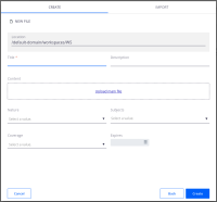
To support creating more elaborate layouts in Designer, we need to create a new grid element.
Goal of that ticket is to make the element created for SUPINT-1709 production ready.
Specification
The nuxeo-grid is a custom element that allows slotted content to be placed in a grid layout. It provides a public API to control the item placement and alignment, which behind the scenes relies on CSS Grid Layout.
Grid API
Nuxeo Grid provides a set of properties to control the dimensions of the grid, item alignment and column and row behavior:
- columns: number of columns.
- rows: number of rows.
- columnGap: the gap in pixels between columns.
- rowGap: the gap in pixels between rows.
- gap: the gap in pixels between cells (same as setting rowGap and columnGap with the same value).
- alignItems: default vertical alignment for children; valid values are stretch, center, start and end.
- justifyItems: default horizontal alignment for children; valid values are stretch, center, start and end.
- templateColumns: default columns template. It consists of a string containing a space separate list of values that denote how the columns behave. Each value corresponds to a column. Valid value formats are auto, px and *fr (e.g. 1fr, 2fr), where fr denotes a fraction of the available width of the table. Settings this property overrides *columns.
- templateRows: default rows template. It consists of a string containing a space separate list of values that denote how the rows behave. Each value corresponds to a row. Valid value formats are auto, px and *fr (e.g. 1fr, 2fr), where fr denotes a fraction of the available height of the table. Settings this property overrides *rows.
Child API
Slotted content of nuxeo-grid can use a set of data attributes to control its position and alignment on the grid. The available attributes are:
- data-column: the column of the grid in which the element will be position.
- data-row: the row of the grid in which the element will be position.
- data-column-span: the number of columns the element will take.
- data-row-span: the number of rows the element will take.
- data-align: the vertical alignment of the element in the cell; valid values are stretch, center, start and end.
- data-justify: the horizontal alignment of the element in the cell; valid values are stretch, center, start and end.
Mapping to CSS Grid
Even though most of the properties described above map directly to CSS Grid properties, we want to reduce the exposure to its public API, limiting the set of valid values they can accept. Values outside this boundaries might work but a warning will be displayed on the console. There is no guarantee that these will keep working with future updates to the nuxeo-grid element or Web UI.
Responsiveness
The nuxeo-grid element does not yet offer any API to control how it responds to changes in size. However, it includes a media query that makes the layout turn into a single column when the screen size is equal or less than 1024px in width.
Sample Code
Here is a simple document layout, which makes use of the API described above to display widgets on two columns (see layout-two-columns.png):
<nuxeo-grid columns="2" gap="16px">
  <nuxeo-input
    role="widget"
    label="[[i18n('title')]]"
    name="title"
    value="{{document.properties.dc:title}}"
    autofocus
    required
    data-column="1"
    data-row="1"
  >
  </nuxeo-input>

  <nuxeo-textarea
    role="widget"
    label="[[i18n('label.description')]]"
    name="description"
    value="{{document.properties.dc:description}}"
    data-column="2"
    data-row="1"
  >
  </nuxeo-textarea>

  <nuxeo-dropzone
    role="widget"
    label="[[i18n('file.content')]]"
    name="content"
    value="{{document.properties.file:content}}"
    data-column="1"
    data-column-span="2"
    data-row="2"
  ></nuxeo-dropzone>

  <nuxeo-directory-suggestion
    role="widget"
    label="[[i18n('label.dublincore.nature')]]"
    name="nature"
    directory-name="nature"
    value="{{document.properties.dc:nature}}"
    placeholder="[[i18n('dublincoreEdit.directorySuggestion.placeholder')]]"
    min-chars="0"
    data-column="1"
    data-row="3"
  >
  </nuxeo-directory-suggestion>

  <nuxeo-directory-suggestion
    role="widget"
    label="[[i18n('label.dublincore.subjects')]]"
    directory-name="l10nsubjects"
    name="subjects"
    value="{{document.properties.dc:subjects}}"
    multiple="true"
    dbl10n="true"
    placeholder="[[i18n('dublincoreEdit.directorySuggestion.placeholder')]]"
    min-chars="0"
    data-column="2"
    data-row="3"
  >
  </nuxeo-directory-suggestion>

  <nuxeo-directory-suggestion
    role="widget"
    label="[[i18n('label.dublincore.coverage')]]"
    directory-name="l10ncoverage"
    name="coverage"
    value="{{document.properties.dc:coverage}}"
    dbl10n="true"
    placeholder="[[i18n('dublincoreEdit.directorySuggestion.placeholder')]]"
    min-chars="0"
    data-column="1"
    data-row="4"
  >
  </nuxeo-directory-suggestion>

  <nuxeo-date-picker
    role="widget"
    label="[[i18n('label.dublincore.expire')]]"
    name="expired"
    value="{{document.properties.dc:expired}}"
    data-column="2"
    data-row="4"
  >
  </nuxeo-date-picker>
</nuxeo-grid>
Caveats
- Having independent gaps for columns and rows might be useful to handle elements that have implicit paddings or margins, such as nuxeo-card.
- The switch to a single column layout at 1024px is not parameterizable by design.
- Elements that take up space on the grid, even if not visible, will create a gap between them and the adjacent cells. This is the standard behavior of CSS Grid and cannot be changed.
- depends on
-
ELEMENTS-1271 Prevent nuxeo-video-viewer from overflowing
-
- Resolved
-
-
NXS-6032 Review Designer catalog jobs and Designer's build.xml
-
- Resolved
-
- Is referenced in

