-
Type:
Improvement
-
Status: Resolved
-
Priority:
Minor
-
Resolution: Duplicate
-
Affects Version/s: None
-
Fix Version/s: None
-
Component/s: Style & CSS
-
Tags:
Following on from https://jira.nuxeo.com/browse/NXS-6331
Width
The width doesn't seem to be working correctly, the width of the box does not change, it always set on 500 (from the max-width of the div)
> Delete this option TBC
or
-> Make width changeable between 300 and 1000 / Or delete this option TBC
(-> Add this info to ? hover )
Button background colour
This always display the original blue colour
-> Add box to set 'Button Background Hover Color' (same as Button 'Background Color')
Padding
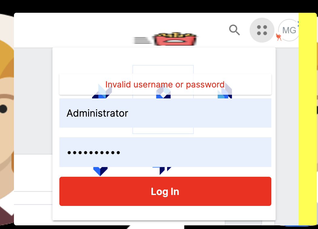
1. If the logo you’re using is taller than the default logo, the layout eats up the padding so the space under the login button becomes very small.
-> The padding should stay consistent
-> Constrain size of logo to less than 300px by 300px
-> Add this info to ? hover
Image guidance
For the bg image fill, it is currently on 'contain' and fills the space only if it is the correct proportions, the yellow in the picture is the coloured background, the image should cover the entire background
-> Suggest dimensions and add this info to ? hover (TBC)

- duplicates
-
NXS-6331 The background image for the login box should fit the login box dimensions
-
- Resolved
-
