-
Type:
Task
-
Status: Resolved
-
Priority:
Minor
-
Resolution: Fixed
-
Affects Version/s: None
-
Fix Version/s: Designer-1.0.0
-
Component/s: Studio Designer
-
Epic Link:
-
Tags:
-
Sprint:nxNest Sprint 9.3.1
-
Story Points:1
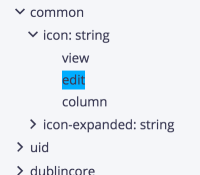
The current blue hover effect doesn't really makes the user feel that she can drag an item in that list to drop it in the editor.
Update the default item styling with:
- increase default right/left padding of each label in the list
- add a transparent border so that the list doesn't move on hover
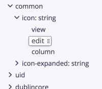
Update the hover styling with:
- a border from the color of the text
- a white background
- a draggable icon (6 squares)
- keep the draggable cursor
- optional: see if the feeling of a tangible box is increased/satisfying with a shadow


