-
Type:
Improvement
-
Status: Resolved
-
Priority:
Minor
-
Resolution: Done
-
Affects Version/s: None
-
Fix Version/s: 57, Designer-0.1.0
-
Component/s: Studio Designer
-
Epic Link:
-
Tags:
-
Sprint:nxNest Sprint 9.1.2
-
Story Points:3
Changes done
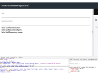
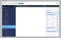
fix main the scrollbar (missing `margin: 0` on body)style header (reduce the difference with Studio)add background colors to highlight the work area to the other columnsPut the `nuxeo****layout.html is not customized yet. [CUSTOMIZE] ` sentence in a centered boxleft column: make selected view more visible (bold is not enough)
Remaining
- add to body font-weight: 100; font-size: .9em; to make the UI lighter
- Update
NXS-3700sentence by "Select on the left panel the template you want to adapt. Then, drop new elements or configure properties." (sorry, I found a simpler sentence after your task resolution) - add a style for these "no result" sentences (to apply to
NXS-3699empty result too)
font-size: 1.2em; line-height: 170%; color: #BBBdc8; font-weight: 100; - Tooltips take ages to appear, it would be cool to reduce this time and make them almost directly to help users learning menus & tabs
- Missing padding (1.3em) in the Visual Editor
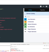
nuxeo-view-editor.nuxeo-view-designer => background: #fff; width: 100%; padding: 1.3em; - Would be cool to remove "Element Catalog” header bar (not necessary, we win space) but it will break accordion behaviour => Reduce accordeon header padding to .5em 2em; in Catalog tab and 0 1em; in Properties tab
- In Element Catalog list, you can add a border-bottom: 1px solid #BBBdc8; to catalog items to improve readability.


