-
Type:
Improvement
-
Status: Resolved
-
Priority:
Minor
-
Resolution: Won't Fix
-
Affects Version/s: 20.1
-
Fix Version/s: None
-
Component/s: Ergonomy / UX / UI
-
Tags:
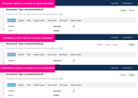
Today, the commit message is followed by the discard button. The save button that will add the message and commit is displayed after the Discard button. Not really intuitive.
See proposal in screenshot.
Tasks:
- Move discard button on the right side, even when commit on save is not activated (see alternative screenshot)
- Update styles of buttons (style update in comment).


