-
Type:
Improvement
-
Status: Open
-
Priority:
Minor
-
Resolution: Unresolved
-
Affects Version/s: None
-
Fix Version/s: QualifiedToSchedule
-
Component/s: Content Views, Ergonomy / UX / UI
-
Tags:
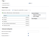
Sometimes checboxes are displayed before their label, sometimes after. We should make them always displayed before labels, because sometimes it is confusing. This is visible on the Content view creation form, where it goes from before the label to after it according to the part of the form you are on (see attached screenshot).
On this screenshot, it should be displayed like this:
Filter Form display: [ - ] Foldable box [ - ] Pop up
…
Quote parameters: [ - ] Yes [ - ] No
Escape parameters: [ - ] Yes [ - ] No
- depends on
-
NXS-369 Checkbox should be refactored as radio button "yes, no"
-
- Resolved
-
