-
Type:
Task
-
Status: Open
-
Priority:
Minor
-
Resolution: Unresolved
-
Affects Version/s: 2.10.5
-
Fix Version/s: QualifiedToSchedule
-
Component/s: Ergonomy / UX / UI
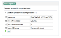
See screenshot.
Once a resource is selected or a field added / filled, the icon to update or delete it must be at the end.
That way:
- it doesn't affect the readability of a form to see quickly if a field is filled or not
- the user doesn't see a trash when he really want to add a field
- is required by
-
NXS-2377 Improve hardcoded workflow assignees definition
-
- Open
-


