-
Type:
Improvement
-
Status: Resolved
-
Priority:
Minor
-
Resolution: Won't Fix
-
Affects Version/s: 5.5
-
Fix Version/s: None
-
Component/s: CMF (deprecated), Content Routing (old, deprecated)
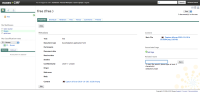
When a user has selected a route on the Properties tab of a case, it is hard to see that the route is actually selected (see attached screenshot). Maybe add an icon before the route name so it is more visible, or display it in a bigger font size ?
