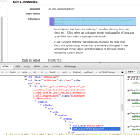
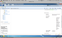
On the Summary tab of a poll, in the Metadata part of tab, the answers are shifted to the right in comparison to the other metadata, leaving an empty space between the "Answers" label and the answers.
Polls Summary tab: improve the layout so that we can see the answers
-
- Assignee:
-
Lise Kemen
- Reporter:
-
Solen Guitter
- Participants:
-
- Votes:
-
0 Vote for this issue
- Watchers:
-
1 Start watching this issue


