-
Type:
Task
-
Status: Resolved
-
Priority:
Minor
-
Resolution: Fixed
-
Affects Version/s: None
-
Fix Version/s: None
-
Component/s: DAM
-
Tags:
-
Team:UI
-
Sprint:UI - 2022-10, UI - 2022-11, UI COOLDOWN - 2022-10
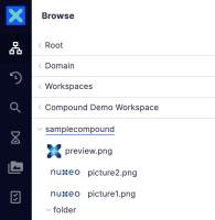
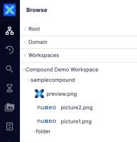
We should add some padding between the collapse/expand icons in the compound document tree entries (see attachments for details).
- is related to
-
NXP-31089 Fix padding between collapse/expand icons and labels in compound document tree
-
- Resolved
-


