-
Type:
Improvement
-
Status: Resolved
-
Priority:
Detail
-
Resolution: Fixed
-
Affects Version/s: None
-
Fix Version/s: 5.1.6
-
Component/s: None
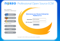
On the authentication screen, the ":" at the end of "Pour améliorer l'utilisation, téléchargez" are on a single line. It would nicer if it was on the same line as the text.
