-
Type:
Improvement
-
Status: Resolved
-
Priority:
Major
-
Resolution: Fixed
-
Affects Version/s: 10.10-SNAPSHOT
-
Team:GANG
-
Sprint:nxGang Sprint 11.1.13
-
Story Points:2
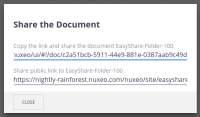
With EasyShare, clicking on the Share document action presents two vaguely labelled and grammatically inconsistent links on which the user must triple-click to select, then either Ctrl+C or right-click and select copy:
Web UI:
Copy the link and share the document <EASYSHARE_FOLDER>.
Share public link to <EASYSHARE_FOLDER>
JSF UI:
Copy the public link and share <EASYSHARE_FOLDER>
Copy the link and share the document <EASYSHARE_FOLDER>
The labels should be clearer, such as:
PUBLIC EASYSHARE LINK:
INTERNAL ACCESS LINK:
(or whatever clearly expresses the difference between the two).
A Copy or Copy to clipboard button beside each link would also make it easier to copy the link to be shared.
- depends on
-
DESIGN-277 Review Share Dialogs
-
- Resolved
-
- is related to
-
NXP-27799 Uniformize some small visual inconsistencies between easyshare and nuxeo-share-button
-
- Resolved
-
- split to
-
ELEMENTS-993 Improve user experience on share links
-
- Resolved
-


