-
Type:
New Feature
-
Status: Resolved
-
Priority:
 Minor
Minor
-
Resolution: Duplicate
-
Affects Version/s: 10.3
-
Fix Version/s: None
-
Component/s: Web UI
-
Epic Link:
Currently we have a big slot of actions, that can create a very confusing layout, with a lot of not priority visual information, always visible.
In smaller screens this doesn't scale properly and requires an horizontal scroll - which results into a not so desirable result.
We should prevent the possibility of the user to get overwhelmed or visually distracted by too many elements always visible.
Conclusions
- On Desktop
Doc & Folderish actions and Selection Toolbar
We should keep always visible 5 actions (plus the 3 dots to access a second level of available actions).
The definition of what's the visible actions it's made by the configuration/order of priority/appearance.
The first ones/more important ones are the ones that should be visible.
On the dropdown, only the hidden actions should be listed (please take under your consideration, that the mockups are illustrating random/repeated actions).
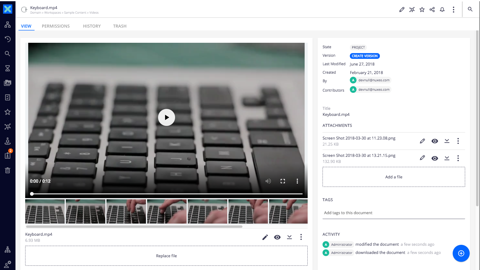
Blob actions
Should follow the same logic, but downsize the maximum visible actions to 3 - respecting the overall order of importance, of the different sections
- On Smaller screens (tablet/ipad)
Doc & Folderish actions and Selection Toolbar
Should follow the same logic, but limit visible actions to 3.
Blob actions
Should follow the same logic, but limit visible actions to 1.
- On Smaller screens (smartphones)
All action slots should only present the 3dots extended menu icon.
The heuristic considered to define the visible actions is the balance between the minimal accessible actions + a general interface not too much disturbing to the user.
If the space is % or px it should be a technical decision, having on mind the technical challenge regarding the implementation.
Mockups overview available at:
https://projects.invisionapp.com/freehand/document/tF1yMC02K


- is related to
-
-

- Resolved
-
-
NXP-24085 Add ellipses on document actions
-

- Resolved
-
-
-
- Resolved
-