-
Type:
Improvement
-
Status: Resolved
-
Priority:
 Minor
Minor
-
Resolution: Duplicate
-
Affects Version/s: 10.1-SNAPSHOT
-
Fix Version/s: QualifiedToSchedule
-
Component/s: Web UI
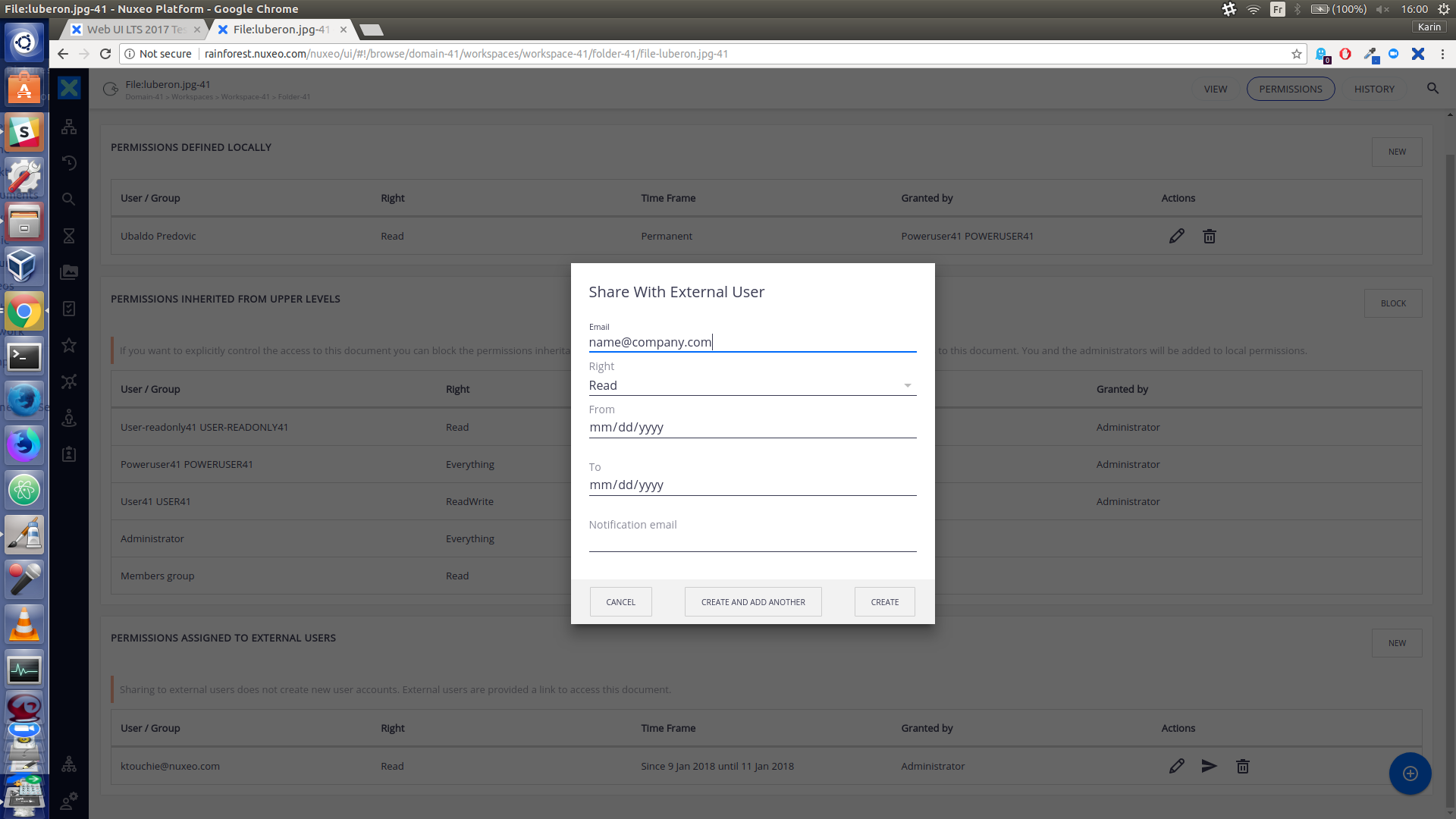
- Navigate to any document on which you have Everything permission
- Click on Permissions tab and click on New from the Permissions assigned to external users panel.
=> Share with external user form appears.
=> The placeholder, name@company.com appears like any other field entry. (Enter a new email address, it appears in the same style). (see screenshots)
Placeholders should be formatted differently to filled-in fields.
If a user thinks it's pre-filled they will double-click name@company.com, try to highlight it, or if they see the cursor, hit the delete button to clear the field.
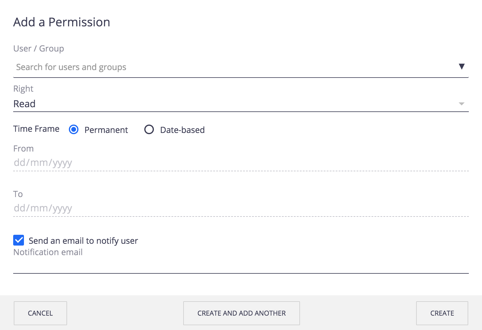
Proposed Solution
On the email fields, I would remove the placeholder, because the name of the label (email) is already very clear nowadays.
In other situations, that may need a placeholder, it should be with a smaller font size, and with a more light color (maybe use as well the styling from the selectivity-placeholder class).
It should in general be aligned with the styling on the invite new user (internal).
This 'styling bug' is only happening on the add new external user - see screenshot-3

- duplicates
-
ELEMENTS-1674 Fix nuxeo-input placeholder default styling
-
- Resolved
-
