Problem
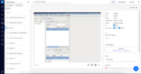
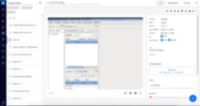
Document actions start to grow in number. Clients adding actions will see even more buttons on screen.
This creates clutter and distracts user from essential actions.
Proposed solution
Use an ellipses pattern on actions.
Only 3 first (configurable on attribute that will manage this behaviour) actions will be shown. If there are more, a plus icon is presented.
When pressed, all action are shown and plus icon rotates 45º (ie. svg animation).
Close/rotated plus pressed results in collapse.
Note
Having a label for each action would be more ideal has we should present a drop list with icon + label for secondary actions.
This may need a topic on html semantic (schema.org, etc) to requires some fields by elements in slots.
- is duplicated by
-
NXP-20391 WEB UI > Display some of the main actions in dropdown
-
- Resolved
-
- is related to
-
ELEMENTS-738 Add a responsive nuxeo dropdown elements
-
- Resolved
-
-
NXP-25417 Change maximum width of actions slots
-
- Resolved
-


