-
Type:
Bug
-
Status: Resolved
-
Priority:
Major
-
Resolution: Duplicate
-
Affects Version/s: 9.3-SNAPSHOT
-
Fix Version/s: 10.2
-
Component/s: Style & CSS, Web UI
-
Tags:
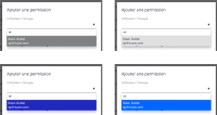
The user suggestion shows the text in white on light grey, which makes it hard to read. This can be seen on the Permission screen and the group suggestion in the User creation form. See attached screenshot.
- is duplicated by
-
ELEMENTS-666 Improve nuxeo-user-suggestion rendering of suggested entries
-
- Resolved
-
- is related to
-
ELEMENTS-452 Add Permissions - Solve dropdown
-
- Resolved
-
- mentioned in
-
Page Loading...
-
Page Loading...
-
Page Loading...
-
Page Loading...
-
Page Loading...
-
Page Loading...
-
Page Loading...
-
Page Loading...
-
Page Loading...
-
Page Loading...

