Style issues:
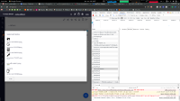
In the left hand side queue when browsing a collection, icons are not properly aligned (both for collections and collection's members)in the data table, the document title styles link seem to do not applywhen browsing a document, the link to the main file and attached blobs are not properly styledtext near to user tags are not aligned (for example in activity list)in the document create pop up, the cancel and create buttons are weirdly too close to each otherwhen dragging file system items over a document content, the drop zone is not highlighted anymoreselected item list is not aligned (see selected_item _list.png)recent documents lists items not aligned

