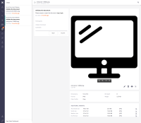
Improve workflow task box, listing and dashboard:
Task Layout
- Change task detail and layout to left side as it is the most important data
- Remove top navigation bar. Users already have the tasks queue, and resolving a task auto-navigates to the next one.
- On the task detail, change into a more readable format without hard labels and so many lines. Include workflow name and 'view graph' link.
- Update Due Date label to Due (missing in the mockup)
Task queue
- remove 'assigned' info
- display Workflow type
- Remove on label before asset title
- Udpate Due Date label to Due (missing in the mockup)
Task dashboard
- 1st column: display workflow name, step and directive (directive may take a whole paragraph).
- 2 column: remove 'assigned' and display file name and path
- Update Due Date label to Due (missing in the mockup)
Proposed mockups included


