-
Type:
 Epic
Epic
-
Status: Resolved
-
Priority:
Minor
-
Resolution: Fixed
-
Affects Version/s: None
-
Fix Version/s: WEBUI-0.8.0
-
Component/s: Web UI
-
Tags:
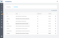
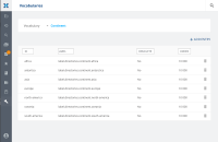
Vocabulary Management in Admin menu should be ported to new WEB UI.
- One single screen.
- 00_admin_vocabularies: A first box as in Analytics screens to select a vocabulary, displaying the first vocabulary by alphabetical order or the latest used?
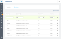
- 01_*add: You can add a vocabulary entry by clicking on the top right button, a box is displayed below table header to fill the required fields. Clicking on ENTER validate the form.
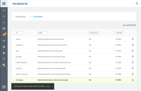
- 02_*added: Once filled, the new row is displayed depending on the active sorting. A feedback toast message appears to confirm the action has been done, with a undo option. The new row is highlighted in green / bold state until you leave the page.
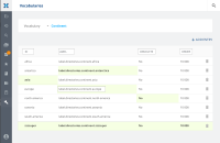
- 03_*edition: User should be able to edit a cell of the table, and see all the changes he did on the screen – highlighted in bold / green. Once user navigates to another view and come back, the changes are not highlighted anymore.
- 03_*edition2 is a version without the green background if the bold behavior is efficient enough.
