-
Type:
Improvement
-
Status: Resolved
-
Priority:
Minor
-
Resolution: Fixed
-
Affects Version/s: 5.9.5
-
Fix Version/s: 7.2
-
Component/s: Ergonomy & UX, User Registration
-
Tags:
The form has changed over time and is not clear enough.
The user registration should be a simple task doable without any headache.
UX Issues:
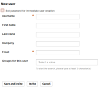
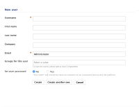
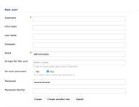
- the common way of creating a user is not suggested (invitation versus immediate user creation)
- the "Set password for immediate user creation" on top is disturbing and displayed too early in the page
- the 3 buttons Save & Invite, Invite and Cancel are too complex and make user not confortable
- The "Save & Invite / Create" button might be not used so often. This action was added for staying in the user creation side rather than fall on the created user profile and having to go back to the user form to be able to create a second one.
The Group creation form should follow these changes (no invitation mode in this case).
- depends on
-
NXP-14437 Feedback on local user creation
-
- Resolved
-
-
NXP-15660 In 'Create user' form in the Admin Center, input fields should not be cleared when clicking on checkbox "Set password for immediate user creation"
-
- Resolved
-
-
NXP-16375 User Registration invitation > Review labels and actions
-
- Resolved
-


