-
Type:
Sub-task
-
Status: Resolved
-
Priority:
Minor
-
Resolution: Won't Fix
-
Affects Version/s: 5.8
-
Fix Version/s: None
-
Component/s: Ergonomy & UX, Seam / JSF UI
-
Tags:
There are 2 usages of drag and drop in the platform:
- dragging a file from the desktop to the browser (import files)
- dragging a document from a zone to another zone in the platform.
From desktop to platform:
- the .dropzone css class is displayed on droppable zones (no visual impact) * the .dropArea which display a gray zone with a text "Drop here ..."
- the .dropzoneTarget css class highlights the border in blue when you can drop safely the doc
- the .dropzoneTargetExtended displays the border in green to have the extended drop mode with metadata edition.
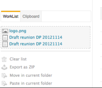
(-> the Clipboard / Worklist is not highlighted, it should be)
From a zone to another:
- the .dropzone css class is displayed on droppable zones (no visual impact), in addition to .dropArea which display a gray zone with a text "Drop here ..."
- the .dropzoneHL css class also highlights in gray the available zones of drop on over.
- the .dropzoneTarget css class is displayed when the document is over the zone where you can drop safely the docdropzoneTargetExtended on over.
(+ A specific css class .dropIntoClipboardCopy is used for the clipboard / worklist.)
Tasks to do:
- Use the same behavior for all the DragAndDrop actions.
- Use the same CSS classes
- The content should be replaced / overlaid by a drop Area + text "Drop your documents here"
- Each droppable zone should be visible when user grab an icon.
- Be able to drop from clipboard/worklist to content views: I can drop from content views to clipboard / WL, but not in the other direction. I don't know why as a user, it's not logical.
- is required by
-
NXP-8683 When user grabs an icon, he should see colored areas where he can drop it
-
- Resolved
-


