-
Type:
Sub-task
-
Status: Resolved
-
Priority:
Minor
-
Resolution: Fixed
-
Affects Version/s: 5.8
-
Fix Version/s: 5.9.2
-
Component/s: Ergonomy & UX
-
Sprint:Sprint 1, Sprint 2
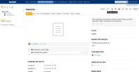
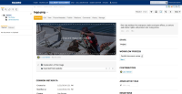
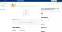
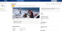
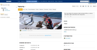
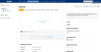
In summary tab, the area of the file and its attachments is not very clear:
- the attachments don't appear like attachments
- the file zone is not consistent (sometimes a preview, sometimes not)
- the drag and drop is a global area not intuitive: no way to add an attachment without having a main file, attachments replacement is hard to understand, etc
