-
Type:
Bug
-
Status: Resolved
-
Priority:
Minor
-
Resolution: Fixed
-
Affects Version/s: None
-
Fix Version/s: Android 1.0
-
Component/s: None
-
Tags:
-
Sprint:nxfit 8.4.6
-
Story Points:3
We've already noticed:
1. A padding issue in the drawer links.
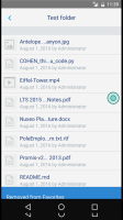
2. The toast is hidden by the black bottom control bar.
3. An issue in the doc view: we can slightly see the previous screen in background on the left.
4. The vertical space between the top bar and the document content is too big.
See screenshots.
Yet 3. and 4. are only visible in the emulator, look fine on a device.
The UI should be reviewed globally.


