-
Type:
Task
-
Status: Resolved
-
Priority:
Minor
-
Resolution: Fixed
-
Affects Version/s: None
-
Fix Version/s: 2.0.0522
-
Component/s: None
-
Epic Link:
-
Sprint:Sprint Drive 7.2-1, Sprint Drive 7.2-2, Sprint Drive 7.2-3
Remaining:
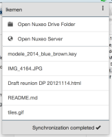
- Systray window: on the right side pause/resume icon and settings icon
- Systray window: Conflict visible: N error in label + conflict window -> rémi
- Systray window: the number of files syncing is not human readable =>
NXDRIVE-295
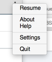
- Systray menu: Menu order should be Preferences / Settings, Help, Quit. =>
NXDRIVE-296 - Systray menu: Style: the menu needs a bit more space to not have the feeling to be trapped
- Settings menu: Add available upgrade -> rémi
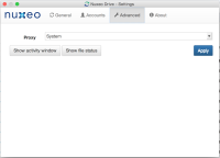
- Advanced menu: activity window + activity status -> only for debug
- Advanced menu: beta in advanced
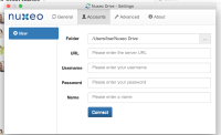
- Account menu: Accessibility: I can't access the blue button by tab for validate my form. -> rémi
- Read mode + edit form -> rémi
Systray
Systray window
logo Nuxeo to add ->liseserver name displayed instead of username2 server icons on the left sideOpen Nuxeo Drive Folder & Open server actions should be simple icons in the server areaSync date displayed below the doc title: now, 1min ago, 1h ago, 1day ago'Synchronization complete' should only displayed with icon (syncing, complete, ...) with a tooltip on themReview all icons: install icon, state icons (syncing, up to date, etc.) ->liseReview style of top / bottom bar: less dark, colored icon in green for √
Systray menu
Send a visual message when I resume sync: for now I've the feeling that it doesn't do anything. At least a small reaction in bottom bar would be perfect if there is nothing to update.
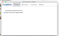
Preferences / Settings Screen
General
This screen is a bit dry We can add the Help link here.
Langage should be displayed at the end to not disturb user with possible refreshed option below.Check Nuxeo Branding -> lise
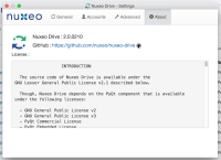
About
more space between info and license -> liselicense title is not readable under the logo -> lise
Credentials
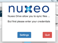
Review text and button labels: sentence says ".. enter your credentials" but button says "settings", not really obvious even if there is only 2 buttons -> Solen + lise
- is required by
-
NXDRIVE-244 Missing pictures
-
- Resolved
-
