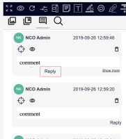
In Annotations browser, when an annotation has a comment with 2 or more lines, a "Show more" link appears in the place where the "Reply" was.
The "Reply" link is placed in between the bottom center and bottom left of the box, creating a visual inconsistency.
- is related to
-
 NEV-135
Submit comment behaviour
-
- Resolved
-
