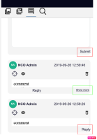
In the Annotations browser, the "Reply" and "Submit" links should be better aligned inside the respective comment boxes - by respecting the box's margin, like the "Show more" link as shown in the screenshot.
- is related to
-
 NEV-135
Submit comment behaviour
-
- Resolved
-
