-
Type:
Bug
-
Status: Resolved
-
Priority:
Minor
-
Resolution: Fixed
-
Affects Version/s: None
-
Fix Version/s: 23.0.0
-
Component/s: Admin Console
-
Epic Link:
-
Sprint:UI - 2024-7
-
Story Points:2
Steps to reproduce:
1. Go to https://ui-2023-test.beta.nuxeocloud.com/nuxeo/nuxeoadmin/
2. Log in as Administrator in Safari browser
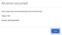
3. Try navigating to each of buttons as Logout, Close(error pop-up) using Keyboard - Tab key
4. Observe the double border around this buttons. (Issue exists only in Safari browser)
5. Log in as Administrator in Chrome browser
6. Start navigating to Logout button using Keyboard - Tab key
7. Observe the thin focus border around the button
8. Keep navigating to some other element using tab Key
9. Now Navigate back to Logout button using Shift Tab & observe the difference in the focus border (It's a common issue. The same issue exists for other buttons Ex: reindex, Abort )
Note: This issue exists for all 3 browsers
Expected result:
1. Double focus borders should not be visible on the tab focus. Single border display (like for other action elements) should be consistent
2. Chrome: Border displayed around the button on tab key focus should be consistent
Actual result:
1. Double focus borders are visible on the tab focus in Safari Browser
2. Chrome: Border displayed around the button on tab key focus is not consistent
- is related to
-
 NAC-33
Admin console - Probes summary on homepage
-
- Resolved
-
- links to
1.
|
QA Task |
|
Resolved | Mansa Bajaj |
|


