-
Type:
 User story
-
Status: Resolved
-
Priority:
Critical
-
Resolution: Done
-
Affects Version/s: None
-
Fix Version/s: 23.0.0
-
Component/s: Admin Console
-
Epic Link:
-
Sprint:UI - 2024-7, UI COOLDOWN - 2024-7
-
Story Points:5
As a system administrator, I can tell the overall status of my nuxeo instance
Context: critical information to know if the system is running. Does not replace an observability tool, but should be available easily and prominently as it is a basic for any sysadmin.
[PROBES-SUMMARY]
AC
The following probes are displayed
- Repository
- Runtime
- Elasticsearch
- Stream
- LDAP Directories
**Rest of the probes names should display as received from server.
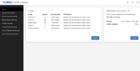
Probes are displayed in a table with the following columns (see below for details)
- Probe
- Success (True / Unknown / False)
- All icons must display a tooltip like:
 True
True
? Unknown (Give priority to neverExecuted: like if it's returned false)
 Error
Error
- All icons must display a tooltip like:
- Last executed (date and time) (date format : April 10, 2024)
- "Never Executed" status will display if no date returned.
- Information ("infos")
Status indicator is displayed as a visual indicator but still accessible with text as needed (i.e., make sure to add an alt tag or anything else that is needed)
- "success": true, icon https://fonts.google.com/icons?selected=Material%20Icons%3Acheck%3A, text: True
- not executed yet ("neverExecuted": true), icon https://fonts.google.com/icons?selected=Material%20Icons%3Aquestion_mark%3A, text: Unknown
- errors, icon https://fonts.google.com/icons?selected=Material%20Icons%3Aerror_outline%3A, Text: False
Icons are loaded locally without having to call google services for confidentiality reasons.
Icons follow criteria defined in our design guidelines: https://doc.nuxeo.com/design/icons/
Information is displayed with a line separation between each entry
I can click on a "Details" button to see all probes and their status (see [PROBES-DETAIL]). [This button is not longer required in the current scope]
Note :
- Only the probes information will be displayed in a tabular format as shown in the attached screenshot (probes-ui.png), along with the Details button. However, Details button won't be functional as part of this story. It will be covered later, as part of https://jira.nuxeo.com/browse/NXP-32258
- No separate tab would be present on the screen. UI will be same as the attached screenshot (probes-placement.png)
- is related to
-
NAC-4 Sections in Home tab are not accessible as expected with increased screen size (200-400%)
-
- Resolved
-
-
NAC-2 Information text in probes section is not readable on resizing browser window
-
- Resolved
-
-
NAC-3 Probes:Last Executed status & Tooltip for success status needs to be corrected
-
- Resolved
-
-
NAC-7 Accessibility issues for first time navigation to buttons & double focus for specific buttons
-
- Resolved
-
- links to
- mentioned in
-
Page Loading...


