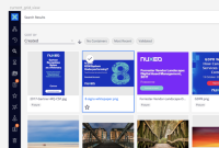
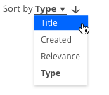
Optimize the space and the general UI of this element, for a better framing with the global context.
Currently we have 2 lines of text/content which are not necessary.
And the line/drop area is always the same width. The width can change corresponding the content.
See also eBay & Google examples here: https://projects.invisionapp.com/freehand/document/rkDCbpve1
Improvement suggestion
The label of the element should be placed before the name/field itself, to be everything in 1 line only.
The space/lenght of the line should be relative to the content, growing as need, assuring only a minimal padding next to the word.
The dropdown should also change its width accordingly to its content, aligned to the left of the input area.
- duplicates
-
NXP-25637 Improve listing top area spacing
-
- Resolved
-
- is related to
-
DESIGN-150 Improve the nuxeo-sort-select element
-
- Resolved
-


