-
Type:
Bug
-
Status: Resolved
-
Priority:
Minor
-
Resolution: Fixed
-
Affects Version/s: 2.2.0
-
Component/s: User & Group management
-
Environment:Chrome 63.0.3239.84
-
Sprint:nxGang Sprint 10.1.2
-
Story Points:1
- In Web UI, create a user and fill in the company (and/or email) field.
- Click on the created user to view it.
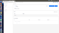
=> "Company" heading displayed on same line and in same style as the actual company name, making it difficult to read. (see screenshot-1)
Expected behaviour:
=> Company name should be in darker font on separate line (see screenshot-2)


