-
Type:
Improvement
-
Status: Resolved
-
Priority:
Major
-
Resolution: Done
-
Affects Version/s: None
-
Fix Version/s: 2.1.3
-
Component/s: UI, User & Group management
-
Tags:
-
Sprint:nxGang Sprint 9.3.3
-
Story Points:1
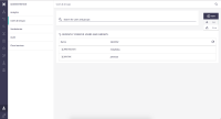
Options are displayed on top of the “New” button. Should be under the button.
What problem are you trying to solve?
Options are displayed on top of the “New” button, hiding it.
This isn't consistent with the platform's standards.
What value would it provide if it were solved?
Improve platform's consistency

