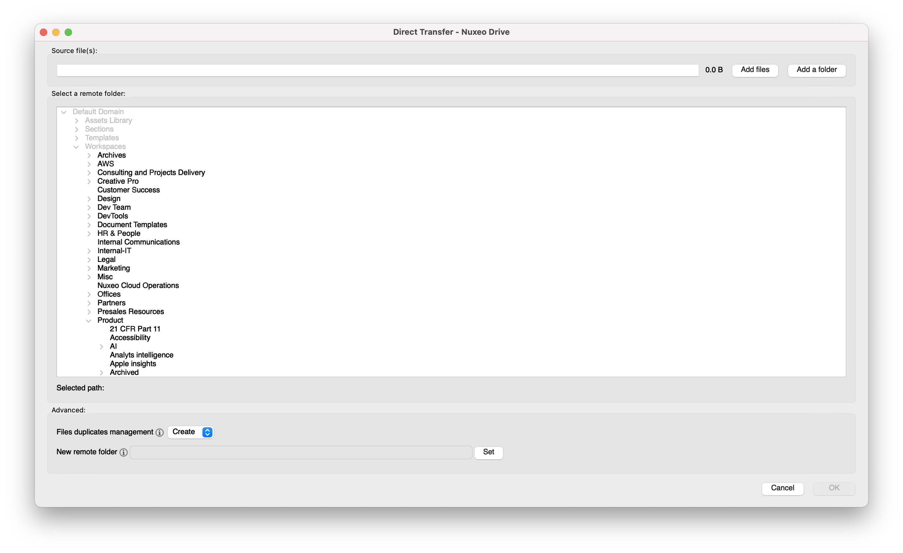
When selecting the Remote Folder on the Direct transfer, it's quite difficult to know where you can upload your document(s): all the folders are grey, you have to unfold them to see where you have the rights to upload them or to know exactly where to upload them.
Design solution
We worked on 3 options as follow:
Option 1: prototype
All text and icons have the same color (Primary text: #161616) to represent that every branch is active and the user can interact with it. The difference between folders with permissions/without permissions is on the behavior of the interaction rather than on the color. When the user clicks on a folder that has no permission to upload to, this branch will collapse/expand (if there are children) but not be able to select it. When the user clicks on a folder that has permission to upload to, this branch is selected and becomes highlighted with a blue background (Primary interactive color: #0066ff) and white text.
- Pros: Easy to navigate back and forth parents/children; all parts of the tree are enabled and clickable.
- Cons: The users can't understand which folders they have permission or not before clicking on it; having two different behaviors may lead to confusion about why that is.
Link to inspect: inspect mockups
Option 2: prototype
Following dropbox's example, instead of presenting a tree, the user sees the parent folders and, as they click on the folder, the current page changes to show that folder's children. The user can navigate back, using the "back" and "forth" arrows on top. As on the first option, the behavior is to open automatically if the user doesn't have permission to upload to this folder, only to view (the folder can't be selected, only opened). If the user has permission to upload to this folder, then the folder is selected with one click - becomes highlighted with a blue background (Primary interactive color: #0066ff) and white text - and opened with a double click.
- Pros: This solution is more scalable, provides an organized view of the folders, especially if there is a great number of children inside a parent.
- Cons: The users can't understand which folders they have permission or not before clicking on it; having two different behaviors may lead to confusion about why that is; Having to navigate back and forth may lead to exhaustion and frustration if the user doesn't know the exact path to reach the desired folder.
Link to inspect: inspect mockups
Option 3: protype
Same as the first option but with the difference that the folders where users don't have permission to upload are presented with the color of a secondary text (#525252).
- Pros: Easy to navigate back and forth parents/children; easy to understand the permissions of the folder at first sight.
- Cons: On the folders with secondary text, the users may still think that they can't access the content of the folder either - not fixing the current issue.
Link to inspect: inspect mockups
- is duplicated by
-
NXDRIVE-2292 [Direct Transfer] Fix display behavior on remote folder selection
-

- Resolved
-
- is related to
-
NXDRIVE-1838 Allow for one time synchronization of a file (Direct Transfer)
-

- Resolved
-
- is required by
-
 NXDRIVE-2356
Rework Direct Transfer Screens
NXDRIVE-2356
Rework Direct Transfer Screens
-
- Open
-