Currently, we have two "tabs" within the aspera area: one for transfers and one for the "upload".
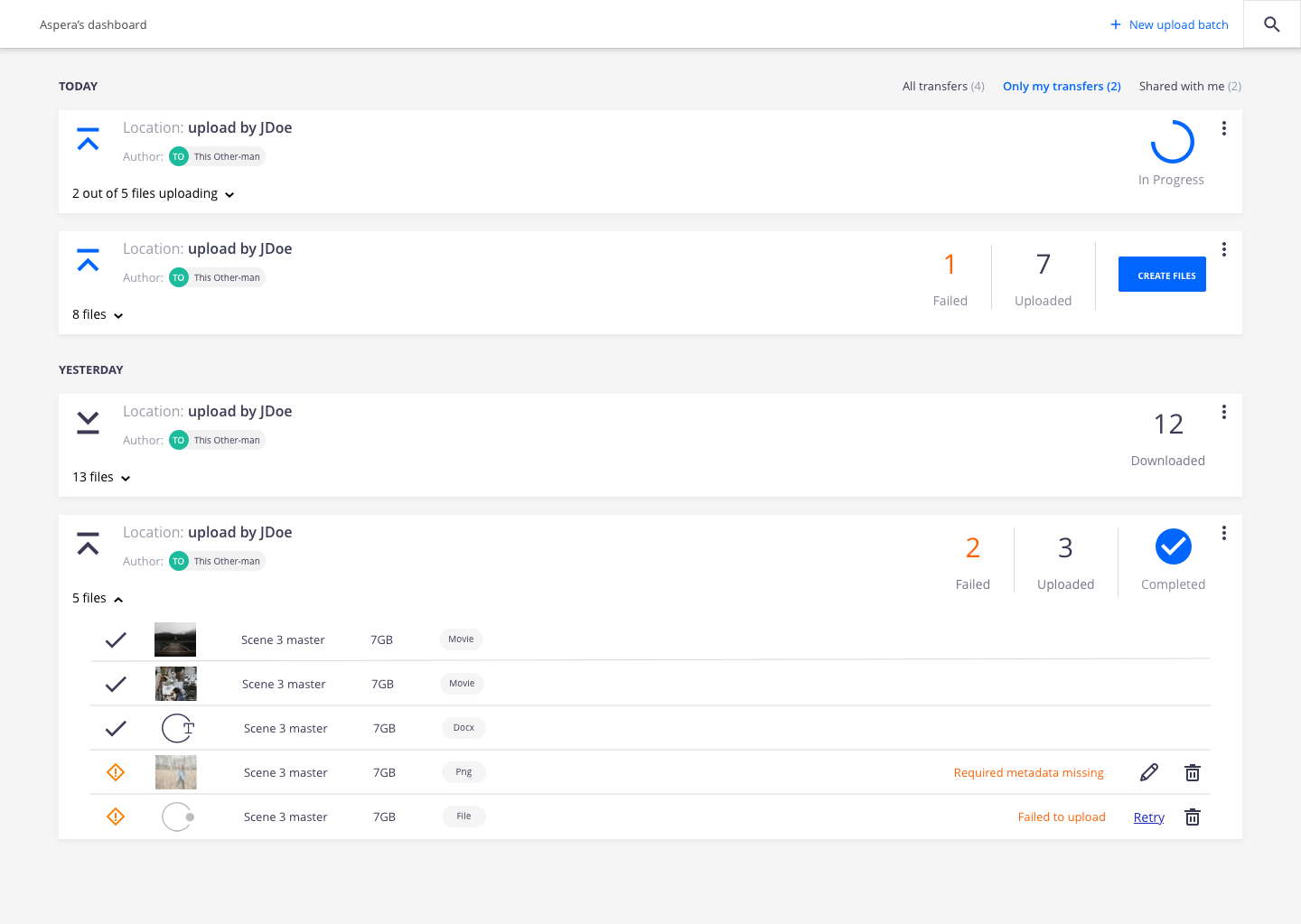
The transfers tab acts as a "dashboard" of the all the aspera transfers you have access to.
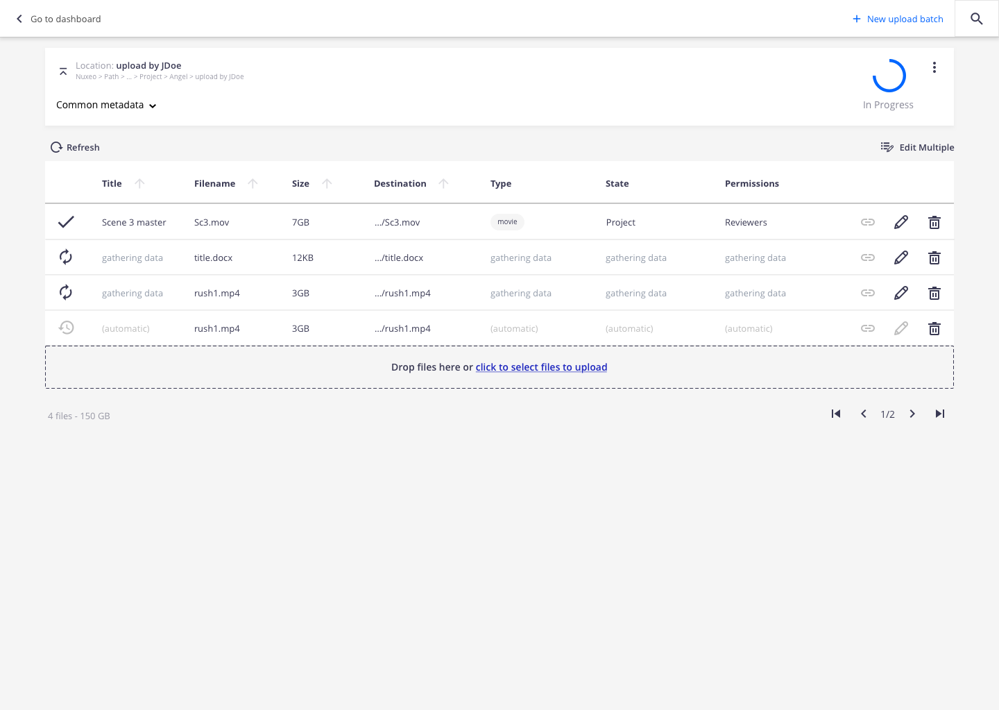
The "uploads" is to allow the user to go to the "active" transfer.
What we have found, since there is no navigational benefit to the tabes (there are not "linked") they end up creating more confusion than is necessary. We should have only one "tab": Transfers. We should remove the "uploads" tab. Users can still access any transfer (active or in progress or completed) by clicking on the transfer title.
Users can create a new transfer simple by clicking on the "new upload" action "button".
AC:
- when I click on the "Uploads with Nuxeo Aspera" item in the user menu, I go to the transfers dashboard.
- when i click on the "upload with aspera" action item from any folderish object, I create an aspera transfer in that target location.
- when I click on the "+ upload" from my aspera area, ... (validate with Carolina)
- is related to
-
NXP-29130 modify the tabs behavior for aspera
-

- Resolved
-