-
Type:
Improvement
-
Status: Resolved
-
Priority:
Major
-
Resolution: Done
-
Component/s: None
-
Epic Link:
-
Sprint:nxApps 2020 Cycle 5
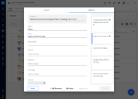
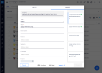
Users have complained about the "edit previous", "edit next" and "apply to all" buttons position. Currently, when selecting the second file on the list, the button "apply to all" is replaced by the "edit next", and the "edit next" is replaced by the "edit previous". This change of positions results in unpleasant user experience.
Solution is to have the buttons "edit previous", "edit next" and "apply to all" centered in the area between the buttons "cancel" and "create". Both navigation buttons (edit next and previous) have the same style applied. When there's isn't a previous file to edit, "edit previous" should be hidden. Same behavior for "edit next".
The "apply to all" button is a text button, in nuxeo blue to distinguish from the navigation, and becomes disabled instead of hidden when it's not the first file selected.
- is related to
-
DESIGN-568 Review checkmark on upload/adding properties
-
- Open
-

